OZERO COFFEE RAMBLERS

LOGO, BRANDING, AND WEBSITE DESIGN

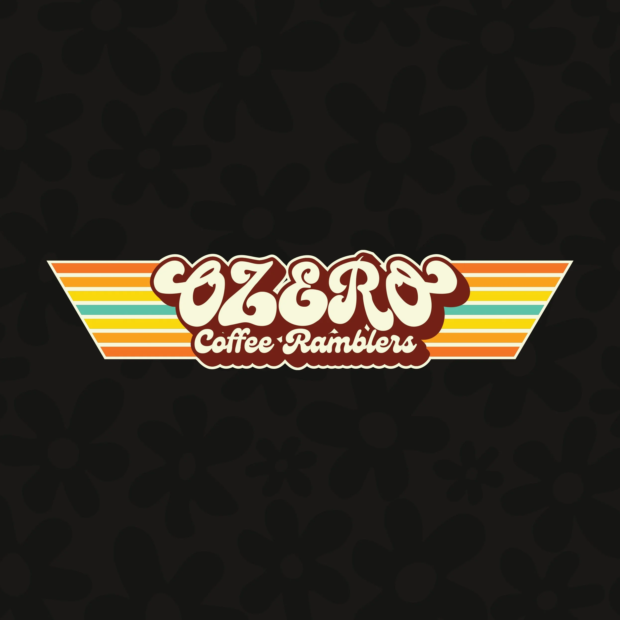
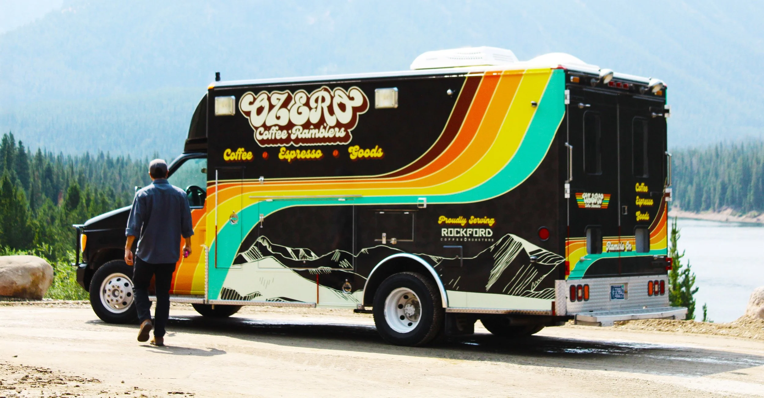
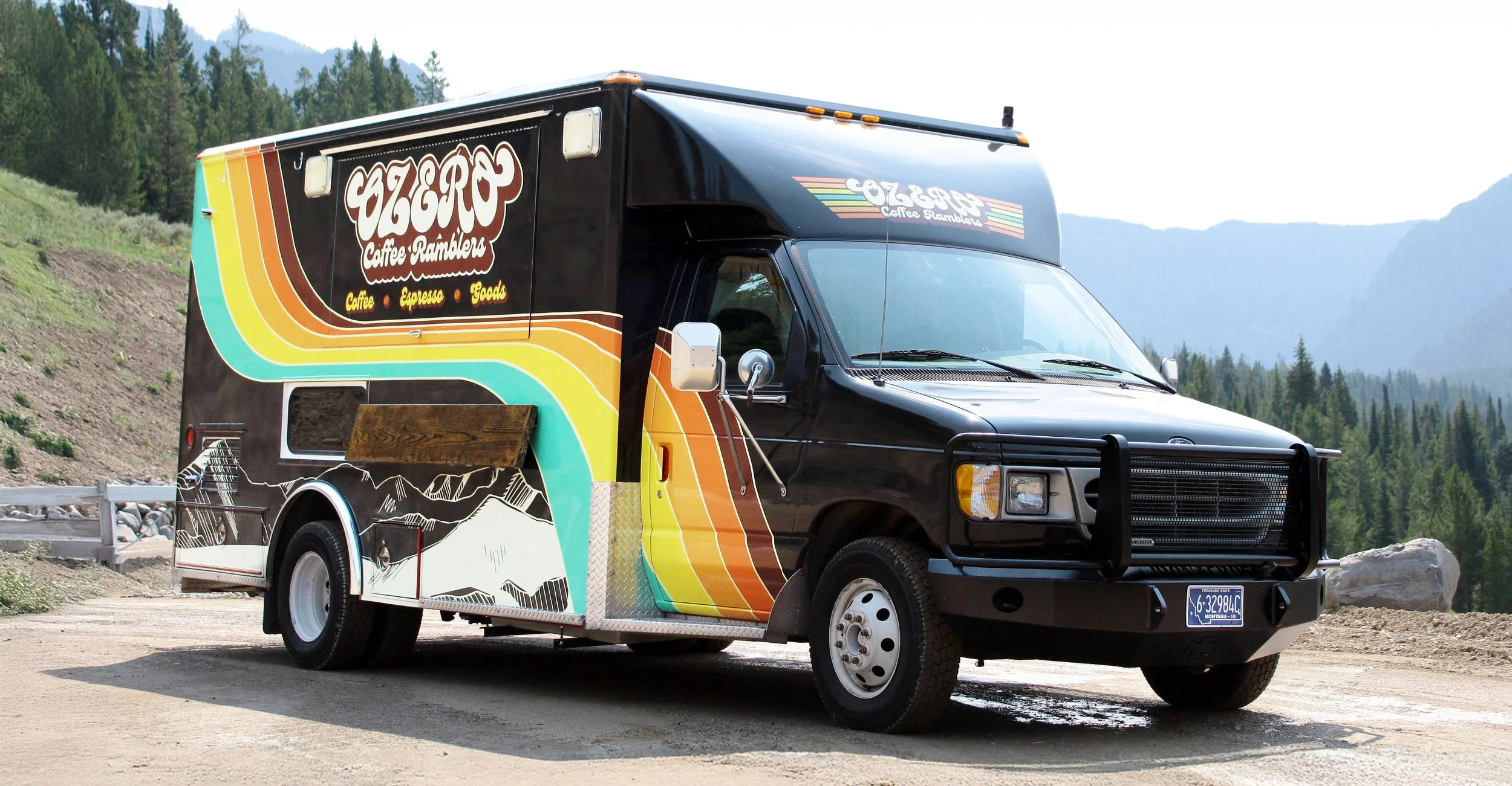
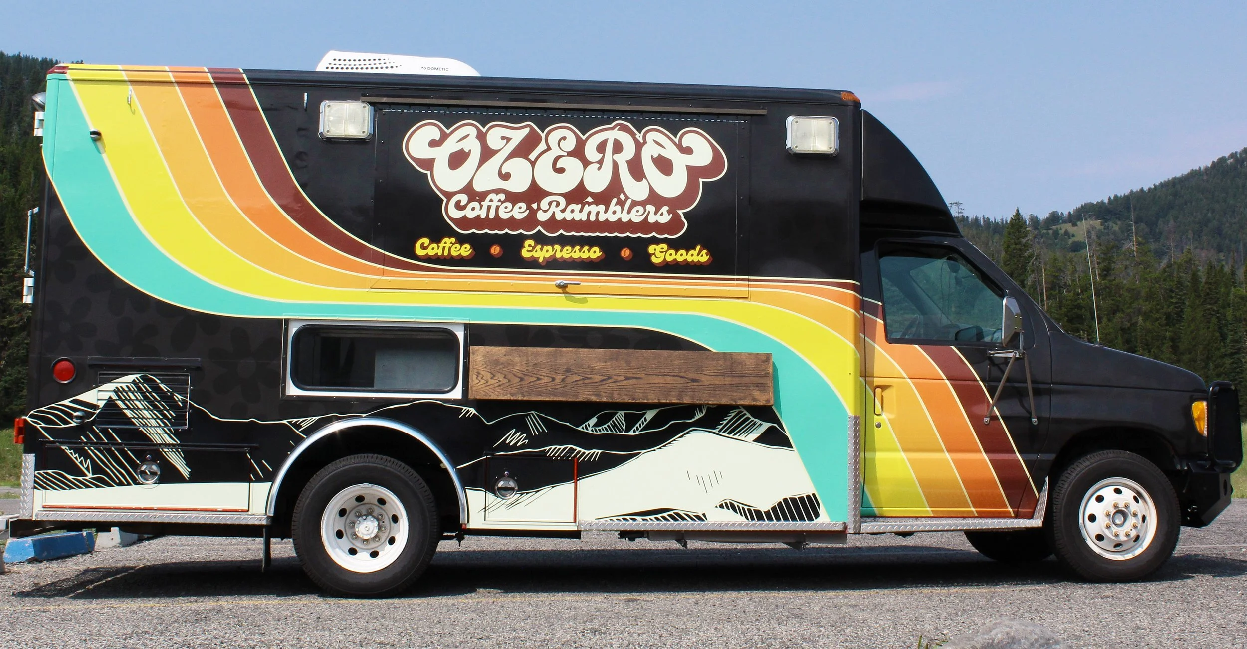
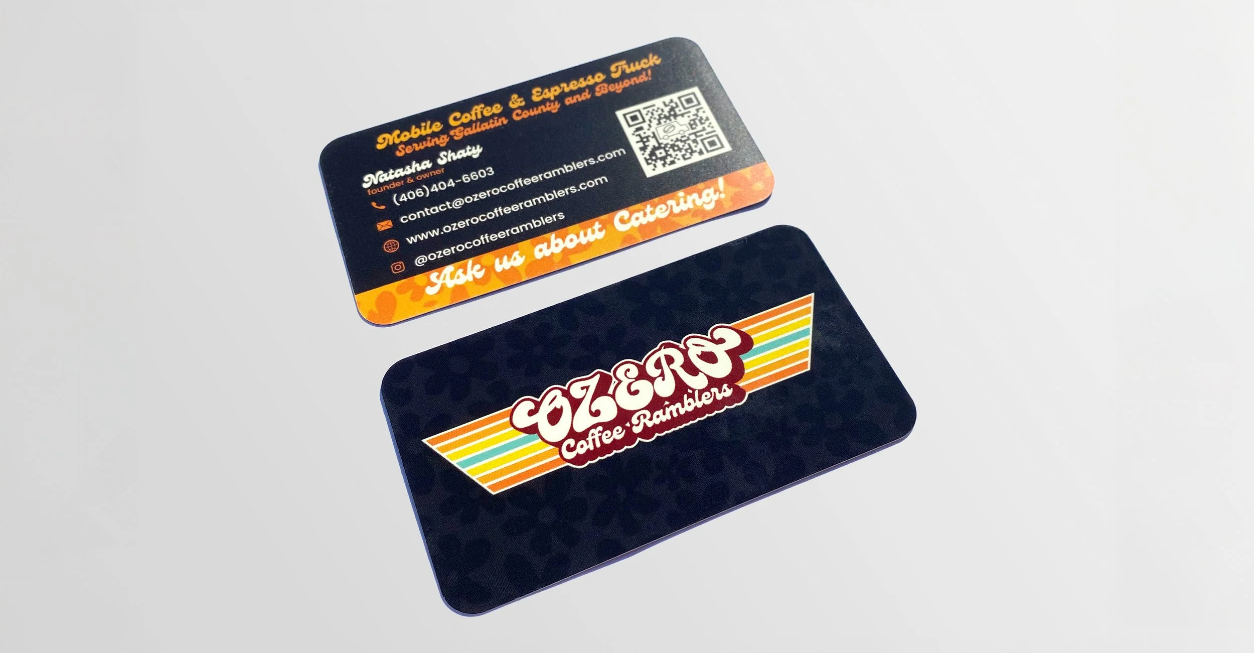
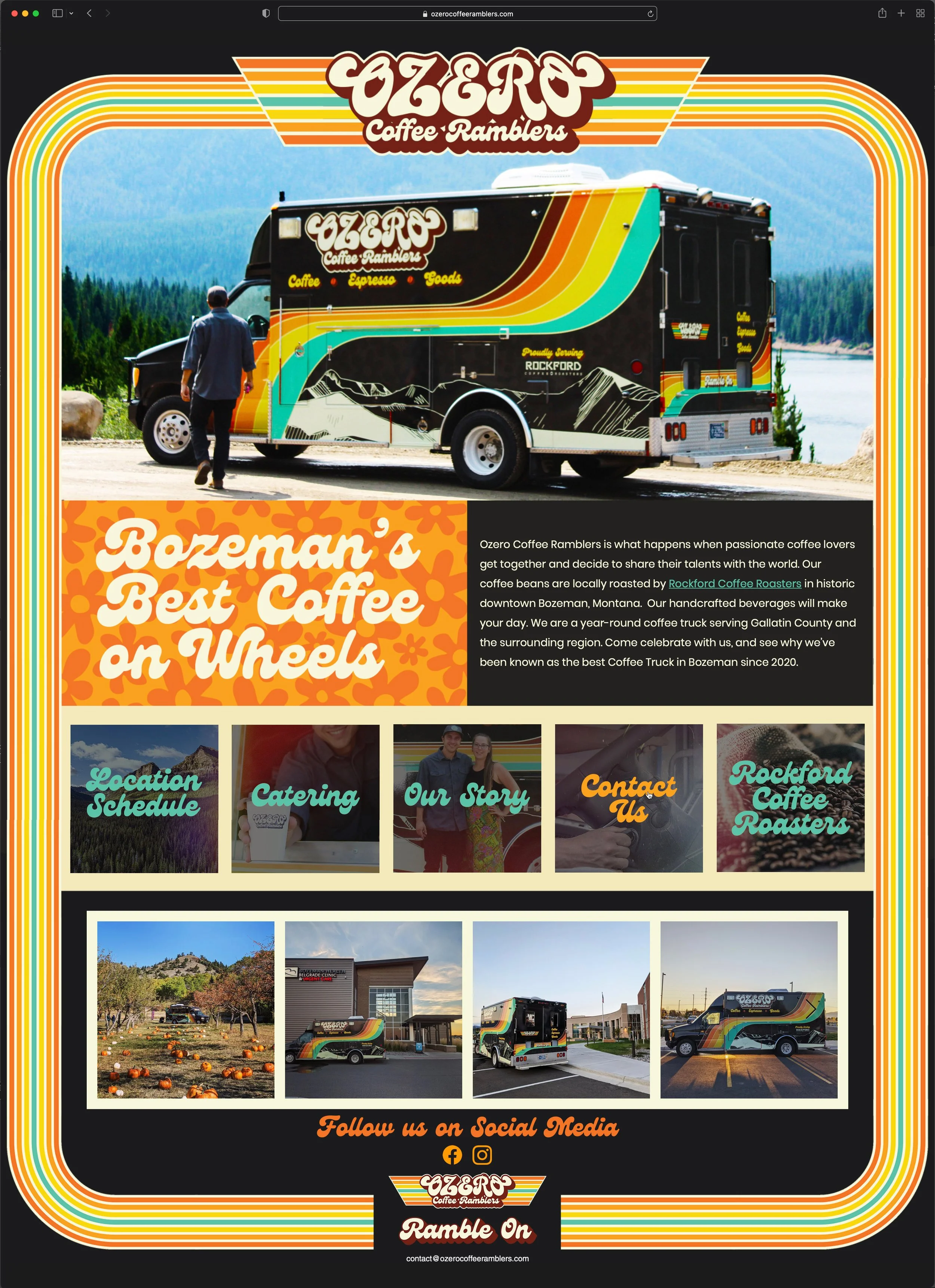
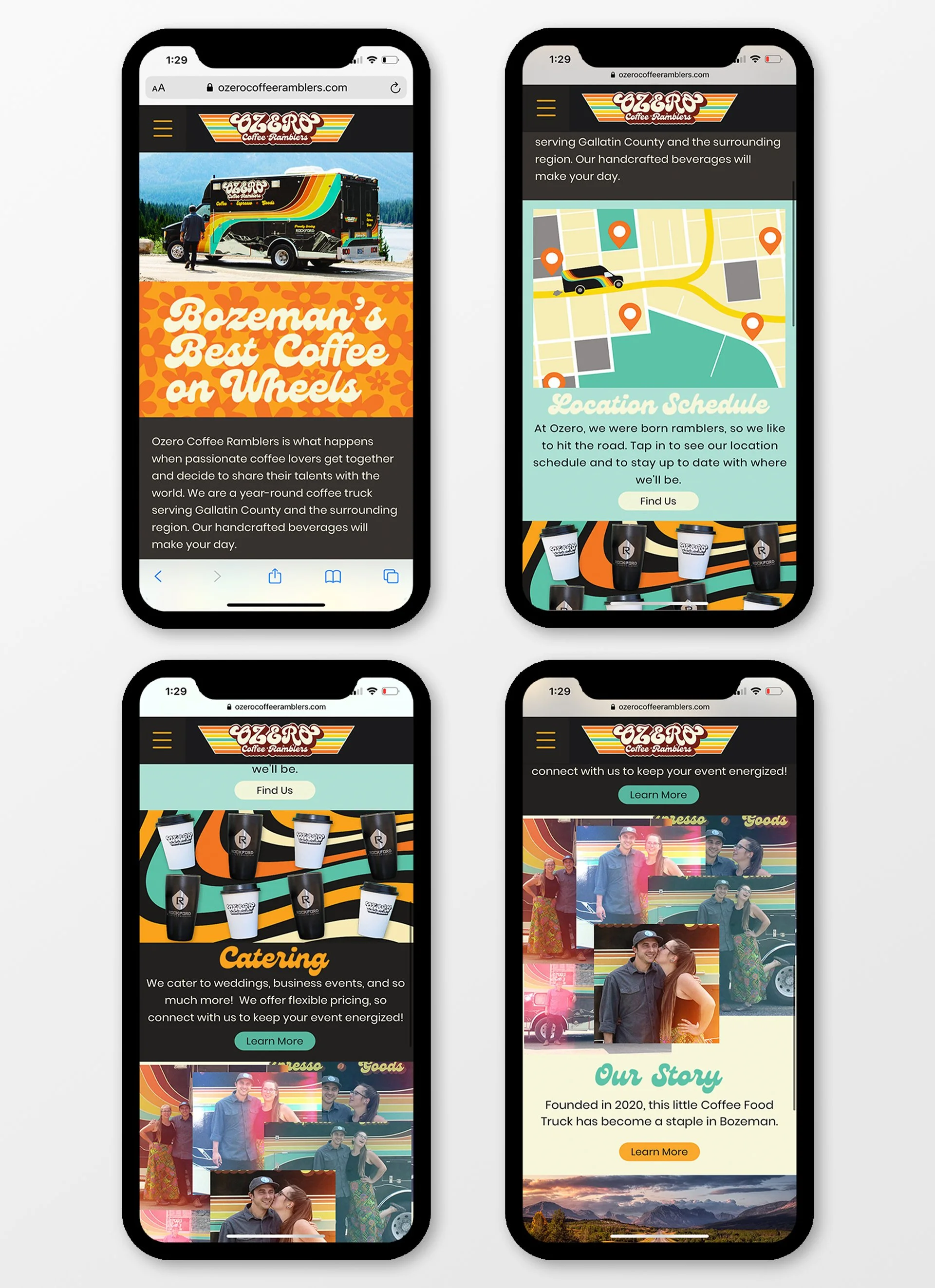
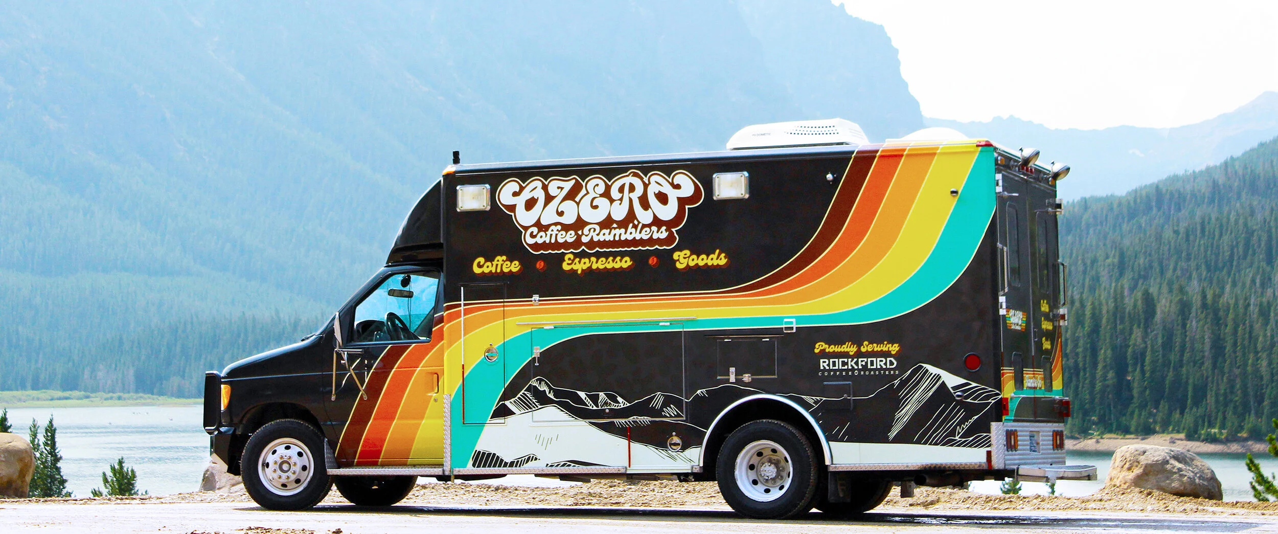
Ozero Coffee Ramblers is a mobile coffee truck serving Bozeman, Montana and the surrounding region. The company was founded by a couple that decided to share their love of quality coffee and espresso, the open road, and vintage thrifted goods with their community and region.

THE CHALLENGE:

This project began from the ground up, and I was tasked to create a bold logo and brand identity that leaned on retro design cues while embodying the company’s independent, adventurous, and fun nature as a mobile business in the scenic Rocky Mountains. The visual identity had to be warm, playful, and inviting to passers-by, but also have a modern twist to signal the quality of the company’s products.
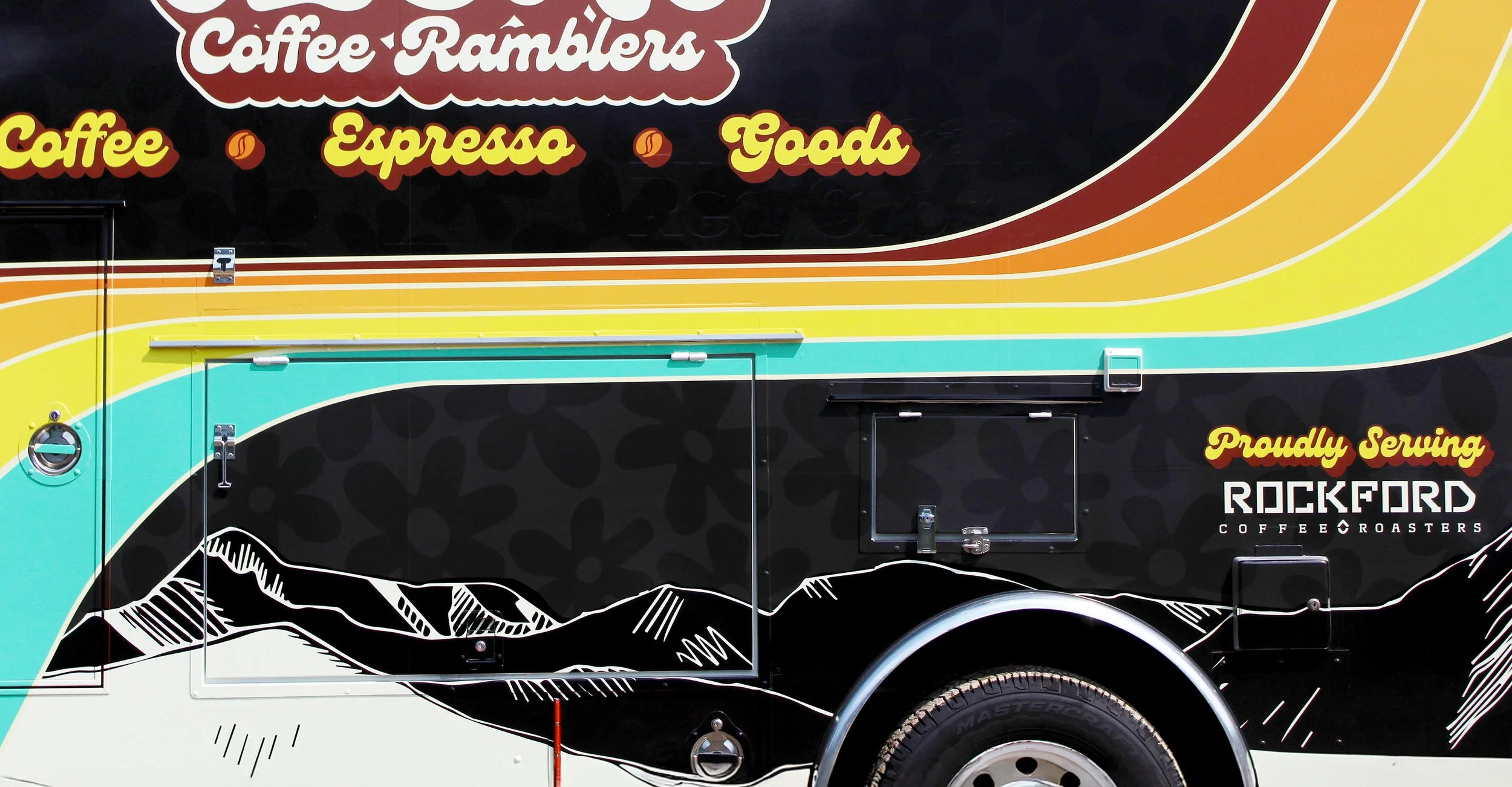
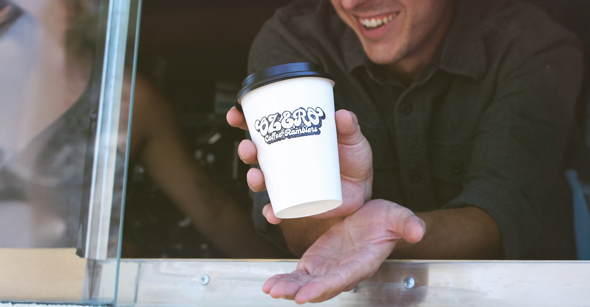
KEY WORDS:

  • RETRO

  • BOLD

  • ADVENTUROUS

  • FUN

  • WARM

  • NOSTALGIC

MOOD BOARD

To begin honing in on how to represent the tone of the brand, I compiled a mood board with images of retro design trends and typography, scenes from the open road, people, and illustrations that communicate the bold, independent, and fun spirit of adventure that Ozero Coffee Ramblers sought to embody.

LOGOTYPE

The Ozero Coffee Ramblers logotype uses bold and groovy hand-drawn letterforms that reference visual elements commonly seen in 1970s design; the letters are heavy, bulbous, expressive, and they convey a sense of motion in their embellishments. A three dimensional drop shadow effect adds weight, further emphasizes the retro influences, and gives the logo contrast to aid in legibility. Behind the text lies colorful striping that gives the design more 1970s flair while also providing further visual interest. The stripes recall the painted lines of highways, tire tracks, and can even be seen as wings behind the text, implying the company’s constant movement like the letterforms themselves. The striping forms the basis for the main visual element of the vinyl truck wrap’s design. The color palette is mostly made up of bold warm colors and a single stripe of turquoise to contrast. They provide a strong and daring pop of color when utilized against the dark grey-black backgrounds that are featured elsewhere in brand assets.

2 cards for web copy.jpg
ozero cup for web.jpg
ozero truck pic 2 brighter for web.jpg

VINYL WRAP

The vinyl wrap design pulls inspiration from the same 1970s design cues while also injecting a modern edge. The striping serves as a bold and colorful eye catcher that references the logotype’s striping as well as retro van paint jobs. This pop of color contrasts well with the sleeker, more modern subdued black and dark grey flower patterns that make up the rest of the body. The mountain range design used by Ozero’s partners, Rockford Coffee Roasters, was also incorporated to signify the partnership and further nod to their mountainous home and adventurous ethic. Precise and practical application had to be considered for the placement of design elements, as physical parts of the truck such as serving windows, lights, and vents could interfere with legibility or break up the design.

ozero desktop screenshot for web 1-1.jpg
ozero desktop screenshot for web 3.jpg

DESKTOP WEBSITE

The desktop webpage makes use of the striping as a frame for the browser window and includes other motifs such as the retro flower pattern and images of mountain forests in keeping with the previously established tone and aesthetic. A simple menu with hover effects allow users to navigate to the site’s pages, and a widget at the bottom displays Ozero’s most recent Instagram posts.

MOBILE WEBSITE

In order to create a more user-friendly experience on a smartphone, the homepage of the mobile site was heavily modified. Here, the layout is oriented towards scrolling down through the page. Icons and images are used to promote engagement and are linked to pages that can also be easily found in the menu bar at the top of the header.

Next
Next

EMANANT